Mobile-Friendly Design
As mobile user habits continue to grow every day, ensuring that your website runs smoothly and seamlessly on every screen is no longer a choice, but a strategic necessity. Especially today, where the first interaction largely happens through mobile devices, fast-loading and easy-to-navigate pages directly increase the time users spend on your site. This positively impacts both your search engine performance and your conversion rates.
As Netürk, we combine aesthetic design with technical performance to ensure your brand presents a professional and trustworthy presence in the digital world. Every detail is strategically planned to create a powerful user experience that turns visitors into customers.
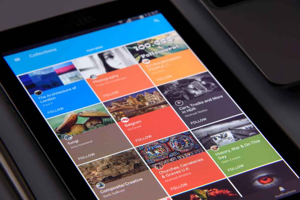
What Is Mobile-Friendly Design?
Mobile-friendly design is a modern design approach that ensures websites adapt seamlessly to different screen sizes and devices. Today, since the majority of users access websites via mobile devices, mobile compatibility is no longer optional but essential.
Thanks to responsive structure, a website provides optimal performance across phones, tablets, and desktops. This improves user experience and enhances the professionalism of the site.
Why Is Mobile-Friendly Design Important?
With the rapid increase in mobile device usage, websites that are not mobile-friendly experience significant visitor loss.
The importance of mobile-friendly design:
- Helps users stay longer on the site
- Reduces bounce rate
- Contributes to better rankings in search engines
- Increases brand credibility
Mobile compatibility is a key factor in Google ranking criteria. Therefore, websites without mobile optimization fall behind in competition.
Responsive Web Design and Mobile Compatibility
Responsive web design forms the foundation of mobile-friendly design. With this approach, the website layout automatically adapts based on screen size.
Advantages of responsive design:
- Compatibility across all devices with a single website
- Lower maintenance cost
- Consistent user experience
- Strong SEO infrastructure
A mobile-friendly structure allows users to easily navigate and interact with the site.
Features of a Mobile-Friendly Website
A successful mobile-friendly website should have the following features:
Fast loading times
Touch-friendly interface
Simple and clear navigation
Optimized images
Mobile-friendly font and button sizes
Strong user experience (UX)
Modern interface design (UI)
Mobile-Friendly Design and SEO Relationship
Mobile-friendly design is one of the most critical parts of SEO efforts. Search engines tend to rank mobile-friendly websites higher.
Mobile SEO advantages:
- Better indexing
- Higher organic traffic
- Lower bounce rate
- Increased conversion rate
With SEO-friendly mobile design, your site is optimized for both users and search engines.
Why Is a Fast Mobile Website Necessary?
Mobile users expect fast results. Slow-loading websites cause visitors to leave.
A fast mobile website:
- Increases user satisfaction
- Boosts conversion rate
- Strengthens SEO performance
To improve site speed, optimized code structure, compressed images, and strong hosting infrastructure are required.
User Experience (UX) and Interface Design (UI)
User experience (UX) and interface design (UI) play a critical role in mobile-friendly design.
A good UX/UI design:
- Helps users quickly find what they are looking for
- Increases interaction
- Strengthens brand perception
On mobile devices, simple and functional interfaces should be preferred over complex designs.
Conversion-Focused Approach in Mobile-Friendly Design
A mobile-friendly website not only attracts visitors but also converts them into customers.
Conversion-boosting elements:
- Clear and attention-grabbing CTA buttons
- Easy communication options
- Simple forms
- Trust-building design elements
Thanks to these elements, mobile users take action quickly and conversion rates increase.
Mobile-Friendly Web Design Pricing
Mobile-friendly web design prices vary depending on the scope of the project.
Factors affecting pricing:
- Originality of the design
- Number of pages
- Additional software requirements
- SEO and performance efforts
A professional mobile-friendly website is an important digital asset that provides long-term return on investment.
Why Should You Choose Mobile-Friendly Design?
Access to a growing mobile user base
Better SEO performance
High conversion rate
Strong brand image
Competitive advantage
Mobile-friendly design is one of the cornerstones of success in the digital world.
Prepare your website for the future with mobile-friendly design!
Take action now and provide your users with a flawless mobile experience.
Frequently Asked Questions
Yes. Today, the number of mobile users has surpassed desktop users.
Responsive design is one of the methods used to achieve mobile compatibility.
Yes, mobile compatibility is an important factor in Google rankings.
Depending on the project scope, it is usually completed within 2–4 weeks.
Other Categories

Corporate Web Design
Detailed Information
Mobile-Friendly Design
Detailed Information
UI/UX Design
Detailed Information
Landing Page Design
Detailed Information
Personal Website Design
Detailed Information
Website Redesign
Detailed Information
Speed-Optimized Design
Detailed InformationDo you need a corporate website?
We are always ready for your project.
Contact us immediately.
Contact us now.Blog Posts

How to Create a Perfect Website for Smartphones?
The expectations of smartphone users are increasing every day. A fast-loading, easy-to-navigate site that fits...
Read More
Web Design Layouts and SEO-Friendly Web Design
Web design layouts determine the visual and functional structure of a site, while SEO-friendly design increase...
Read More
What is UI/UX Design? How is it Done?
UI (User Interface) and UX (User Experience) design is the process of designing how digital products (websites...
Read More
How Does AI Read Websites? What Determines Recommendations? | Netürk Web Design
The rules of search engines have changed — and so have expectations. Today, digital visibility is no longer ju...
Read More
Differences Between Web Design and Website Development
While web design focuses on the visual appearance and user experience of a website, website development builds...
Read More
2025 Web Design Trends: From Minimalism to Artificial Intelligence
As we enter 2025, web design is undergoing a major transformation. With emerging design trends, innovative dig...
Read More
User Experience (UX) and Conversion Rates (CRO)
User experience (UX) directly affects the time visitors spend on your website and the quality of their interac...
Read More
10 Things Great Websites Have in Common
A website can look impressive and still fail to generate trust, leads, or sales. After working with businesses...
Read More